By Moreno Zanotto
In the fall of 2016, Transport Canada assembled a working group to identify options for mitigating the safety issues surrounding cyclists and pedestrians (known as vulnerable road users, or VRUs), and heavy goods vehicles (HGVs). As a stakeholder in cycling safety and a Public Health Agency of Canada funded project, BikeMaps.org has provided input and feedback on the countermeasures being assembled.
Collisions with motor vehicles present the greatest safety threat to people cycling[1], and heavy vehicles (including trucks and buses) are overrepresented in fatal collisions with cyclists[2]. There are numerous interventions that can help improve road safety for VRUs (we’ll focus on cyclists in this post), although not all will be equally effective. For guidance on which interventions are most effective at protecting cyclists, we can look to the Netherlands, which has a large number of cyclists, yet has achieved some of the safest streets in the world. The Dutch strategy to improve road safety is known as Sustainable Safety. This philosophy treats the road system as inherently unsafe and regards humans as imperfect users of the system (we make mistakes and disregard rules)[3]. With that as the starting point, Sustainable Safety works to reduce the frequency and severity of collisions so that no one should die or be seriously injured on the road. Improving the subjective safety of vulnerable road users is also a key objective as feeling safe is very important to get more people to cycle for more of their trips. The results for the Netherlands has been impressive. Since the adoption of Sustainable Safety in the early 1990s, the number of traffic fatalities has decreased 45%[4].
Under Sustainable Safety, the road system (itself comprised of people, vehicles and the roadway) is organized around five principles[3]. Under these principles, we’ve listed five interventions that can systematically improve road safety for cyclists:
1) Homogeneity (of mass, speed, and direction)
Road users of greatly different mass and speed (e.g. trucks and cyclists) are segregated unless differences in speed can be reduced. A sustainably safe road system separates cyclists from car and truck traffic along major roads while mixing users under low-speed conditions on residential streets.
Segregate Modes on Major Streets (Build Protected Cycle Tracks)
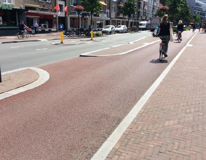
Cyclists in a protected cycle track. People driving, cycling, and walking are segregated on this busier distributor road because car volumes and speeds do not allow for the safe mixing of different road user.
Continue Separation of Modes into the Intersection (Build Protected Intersections)
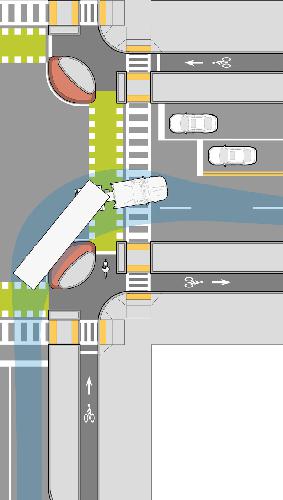
Protected intersections keep cyclists out of the truck’s blind spot and away from danger. Half of the fatal bicycle collisions with HGVs involve a side impact[1]—a problem easily avoided with safe junction design and signal timing. (Image credit: MassDOT)
2) (Mono)functionality
Roads are classified based on their function as either through roads for high volumes of fast-moving traffic or for local access to destinations and residences (plus a third type to connect through roads with access roads).
Separate Bicycle and Truck Routes
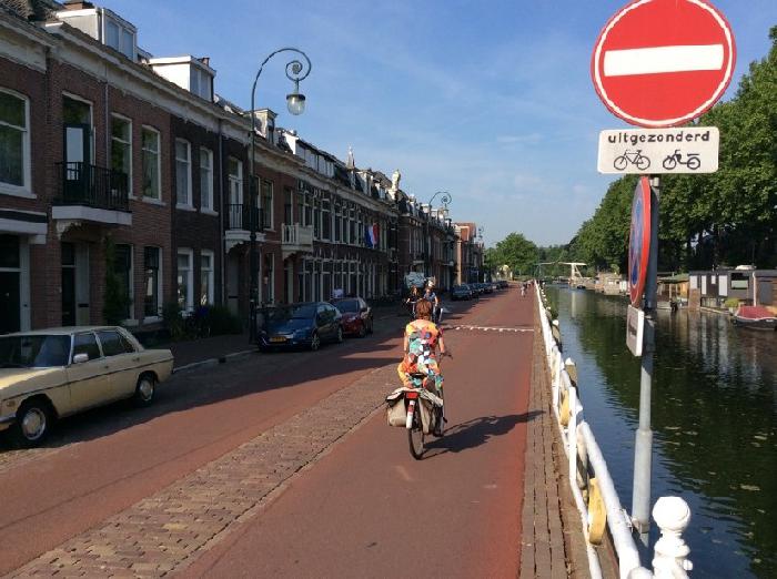 All residential streets are 30 km/h and employ some form of motor traffic calming, such as the ‘No Entry’ (except bicycles) sign on this local street in Utrecht. No long-distance car trips can be made on this street; it’s just for accessing the residences on this block. Mixed traffic conditions are possible because of low car speeds and volumes, otherwise, segregation of modes is necessary.
3) Predictability
Recognizable and consistent road designs make anticipating other road users’ behaviour (and where road users can be found) easier. The design should also encourage safer travel speeds.
Develop Recognizable Road Surfaces and Consistent Priority Procedures
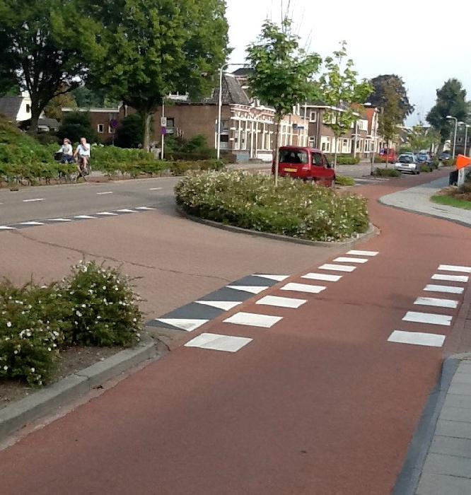 Features such as elephants’ feet (indicating a cycle crossing), sharks’ teeth (give-way markings), and red asphalt (only for cycle paths) create a consistent look and feel for crossings where cyclists have priority. There is no ambiguity here—cyclists will be crossing and they have the right-of-way. Clearly recognizable and consistent design leads to predictable behaviour and safer streets.
4) Forgiveness
When road users make mistakes (and they will), the design softens the consequences.
Side-underrun Protection
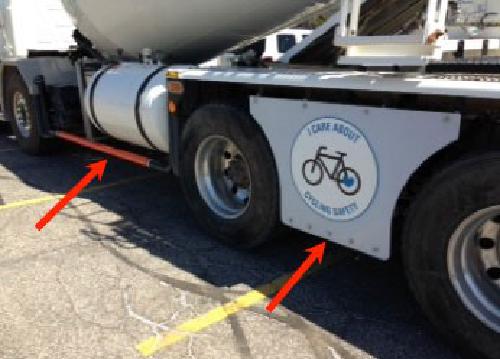
In the event of a side collision between a cyclist and HGV, side-underrun protection prevents cyclists from falling under the truck and being run over by the rear wheels[5]. Side-underrun protection should be mandatory on all new heavy goods vehicles owned or operated in Canada. Lafarge Canada is voluntarily installing side guards and rails on its fleet.
5) State Awareness
Is the ability to assess one’s capacity, and that of others, to safely operate a vehicle or bicycle. This includes an altered state of mind from the use of alcohol and drugs, level of education and training to perform the driving or cycling task, and user competency (which varies based on experience and age). Road safety measures centred on regulations, education, and enforcement are organized under this principle.
People are vulnerable, they are fallible, and they don’t always follow the rules. Our road system must be designed to reflect this reality so that no one should die on the road. Separating incompatible road users in space or time, improving the predictability of road user behaviour, and making the road system more forgiving can help prevent collisions and reduce the severity of injuries should a collision occur. Except for side-underrun protection, the road safety improvements mentioned above are not specific to heavy vehicles and can yield safety benefits for all road users.
BikeMaps.org: Making Cycling Safer!
Incidents with HGVs are rare, but when they do occur, injuries are usually severe. As the only tool to systematically collect near-miss incident reports, BikeMaps.org can be used to identify danger spots before serious issues occur.
References
- Office of the Chief Coroner for Ontario. Cycling Death Review.; 2012. http://www.mcscs.jus.gov.on.ca/sites/default/files/content/mcscs/docs/ec159773.pdf.
- Transport Canada. Canadian Motor Vehicle Traffic Collision Statistics 2015.; 2013. http://www.tc.gc.ca/media/documents/roadsafety/TrafficCollisionStatisitcs_2011.pdf.
- SWOV. Advancing Sustainable Safety: National Road Safety Outlook for 2005-2020. (Wegman F, Aarts L, eds.). Leidschendam; 2006.
- SWOV. Road deaths in the Netherlands. SWOV Fact Sheet. https://www.swov.nl/en/facts-figures/factsheet/road-deaths-netherlands. Published 2017. Accessed December 4, 2017.
- Patten JD, Tabra C V. Side Guards for Trucks and Trailers.; 2010. http://www.safetrucks.ca/?page_id=6.
- Massachusetts Department of Transportation. Separated Bike Lane Planning & Design Guide.; 2015. https://www.mass.gov/lists/separated-bike-lane-planning-design-guide. Accessed December 4, 2017.
- Lafarge Canada. Vehicle Safety. https://www.lafarge.ca/en/vehicle-safety. Published 2017. Accessed December 6, 2017.


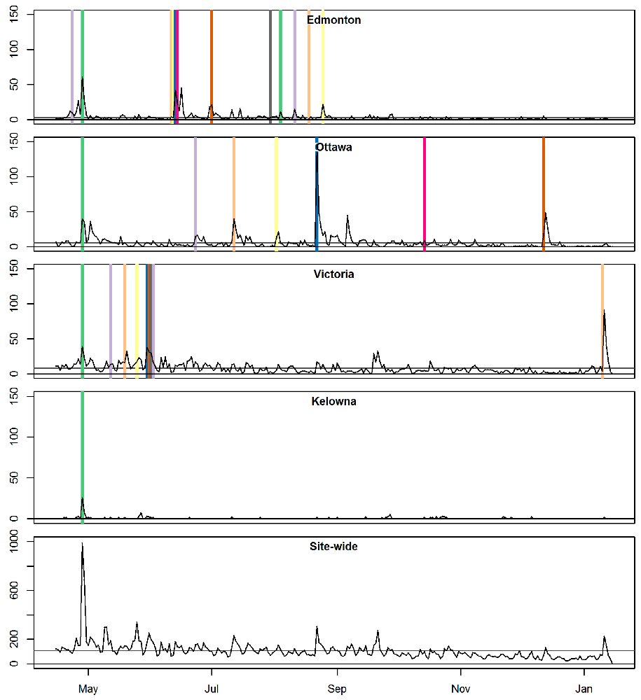 Figure 1. Web views (lines) and promotion events (vertical lines; not to scale)
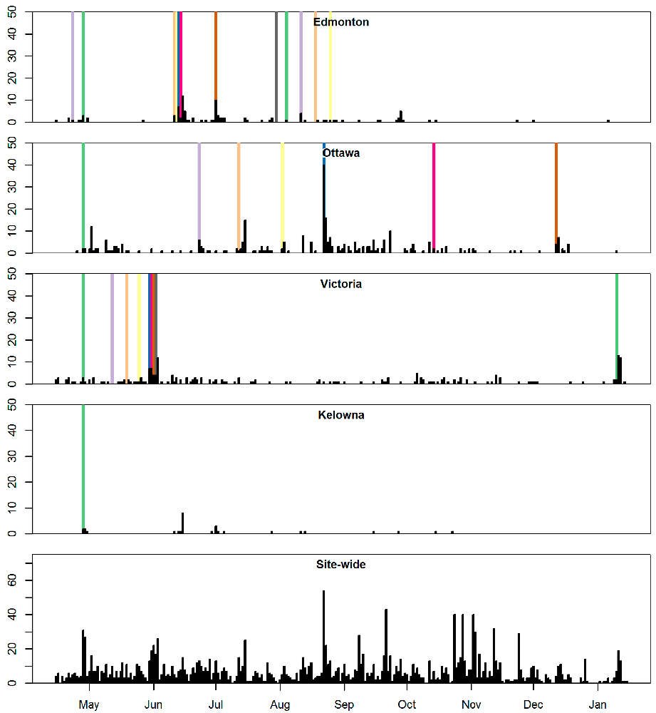 Figure 2. Incidents reported (barplots) and promotion events (vertical lines; not to scale)
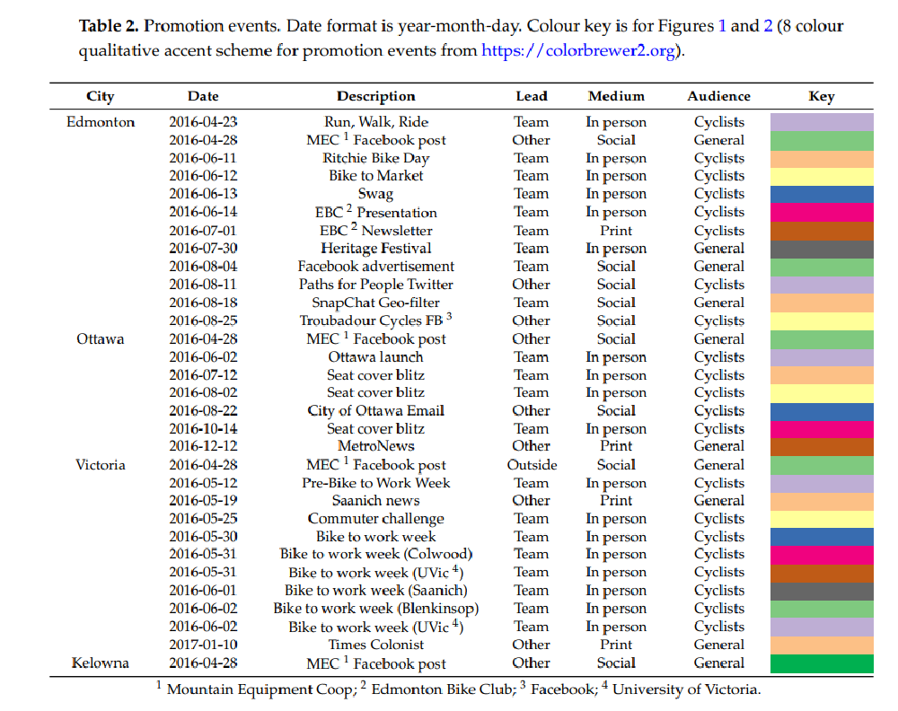
 Base map tiles by
  Base map tiles by